I have a website now! Woohoo! I'll probably re-blog all this content over there.
christopherstclair.me
still (very much) under construction. Stay tuned!
Wednesday, October 19, 2011
Monday, October 17, 2011
Digital Painting Stuffs
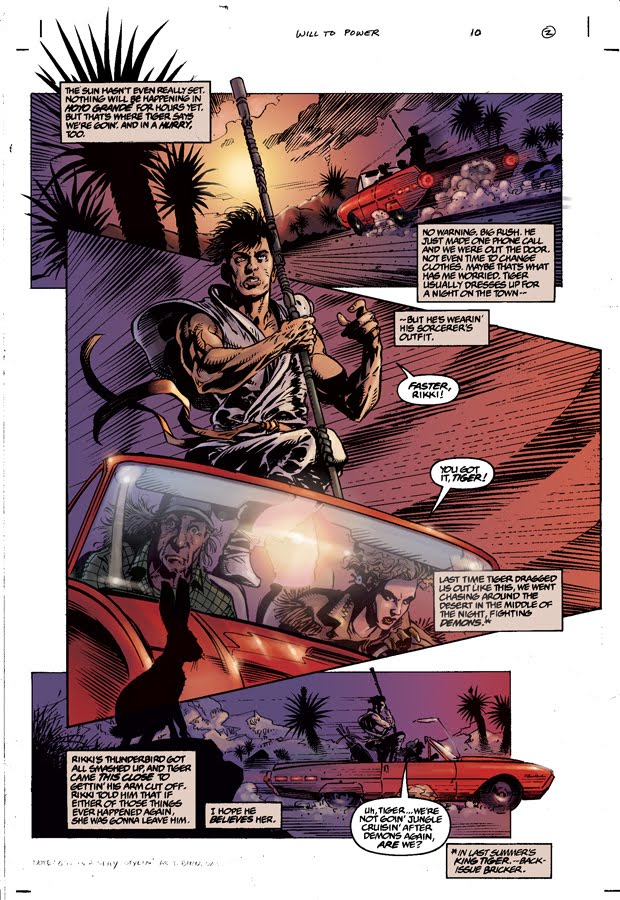
Some pieces I've done for my digital painting and lettering applications for comics class. These first ones were coloring only, the linework was provided.


These are original art pieces, everything by me.


Fun fun!


These are original art pieces, everything by me.


Fun fun!
Monday, October 3, 2011
Test Render!
Here's a really quick (two hour finish for 18 frames, ink and color) test of the 'finished look' with the upper right style from the charts below. It works fairly well, actually. Obviously it'll be cleaner and more careful in the final version, and I'm pretty confident with handing out my finished linework to minions for coloring since it's easy flatting. So I have proven I can do it. Now to go from 18 frames to... hold on. Let me calculate this.
2160. There are about 2160 frames in my film. So I just have to do this a little higher quality another 120 times.
EASY AS PIE. See? Simple. No sweat.
It took me 2 hours to do the inking and coloring. So it'll be about 240 hours of work all told, not counting the actual rough animation (which I can do very quickly, probably an additional 100-150 hours). So this whole shebang (minus layouts and shading) will take 365 hours of my life. That's only 15 days. So if I don't sleep, eat, or shower I could finish my entire senior film in half a month.
I LOVE MATH.


Wednesday, September 28, 2011
Layouts and Mischief
Look, layouts! I did a big 3D model of my space so I could camera scout and not get messed up perspective and whatnot. I can post the model if y'all would like, but it's definitely a giant party of spotlights to get the shadows right.
I'll be painting on top of these layouts for the final product.
I'll be painting on top of these layouts for the final product.
Monday, September 26, 2011
Production stuff
So I need to pin down exactly what I'll be looking at for the next five months, give or take. I decided to take it to my class for a vote so I can get multiple opinions. Here's my sheet of four possible style choices (I personally like lower left and upper right, what I've labeled "Disney" and "Superfine" respectively).

And here's some shading options. It's honestly not more than a few seconds to move from the simple cel shading to the blurred shading, plus the hilites. I can always omit the hilites if I run out of time. Or toss it to some sophomores to work on. The "disney" style actually looks pretty good with the finished shading, even though I was originally more psyched about "superfine". Disney takes longer because the linework is colored.

Thoughts?
Wednesday, September 21, 2011

Subscribe to:
Posts (Atom)